Marketing Designer Case Study: B2B Product Catalog & Sales Enablement Strategy

Marketing Designer Case Study: B2B Product Catalog & Sales Enablement Strategy

The Challenge

Galactic’s online merchandise catalog was a key digital touchpoint within its employee incentive programs, but an outdated structure and limited filtering capabilities created friction throughout the user journey. Previous optimization efforts through third-party partners had failed to produce meaningful improvements in user engagement or conversion, creating an opportunity to rethink the catalog experience from a user-centered perspective.


The Solution

To address these challenges, I developed a catalog redesign strategy focused on improving navigation, product discoverability, and content relevance for targeted user segments. Using competitive benchmarking and user-centered design principles, I restructured the digital experience to make merchandise easier to browse, filter, and evaluate. The resulting concept demonstrates how strategic UX design and information architecture can reduce friction, improve digital engagement, and create a more effective online experience for employee incentive program participants.


My Role:

Information Architecture, User Task flows, Wireframes, Prototyping


Tools:

Illustrator, Axure, Adobe XD, Photoshop


Client:

Galactic Performance Solutions

Competitive Analysis and Research

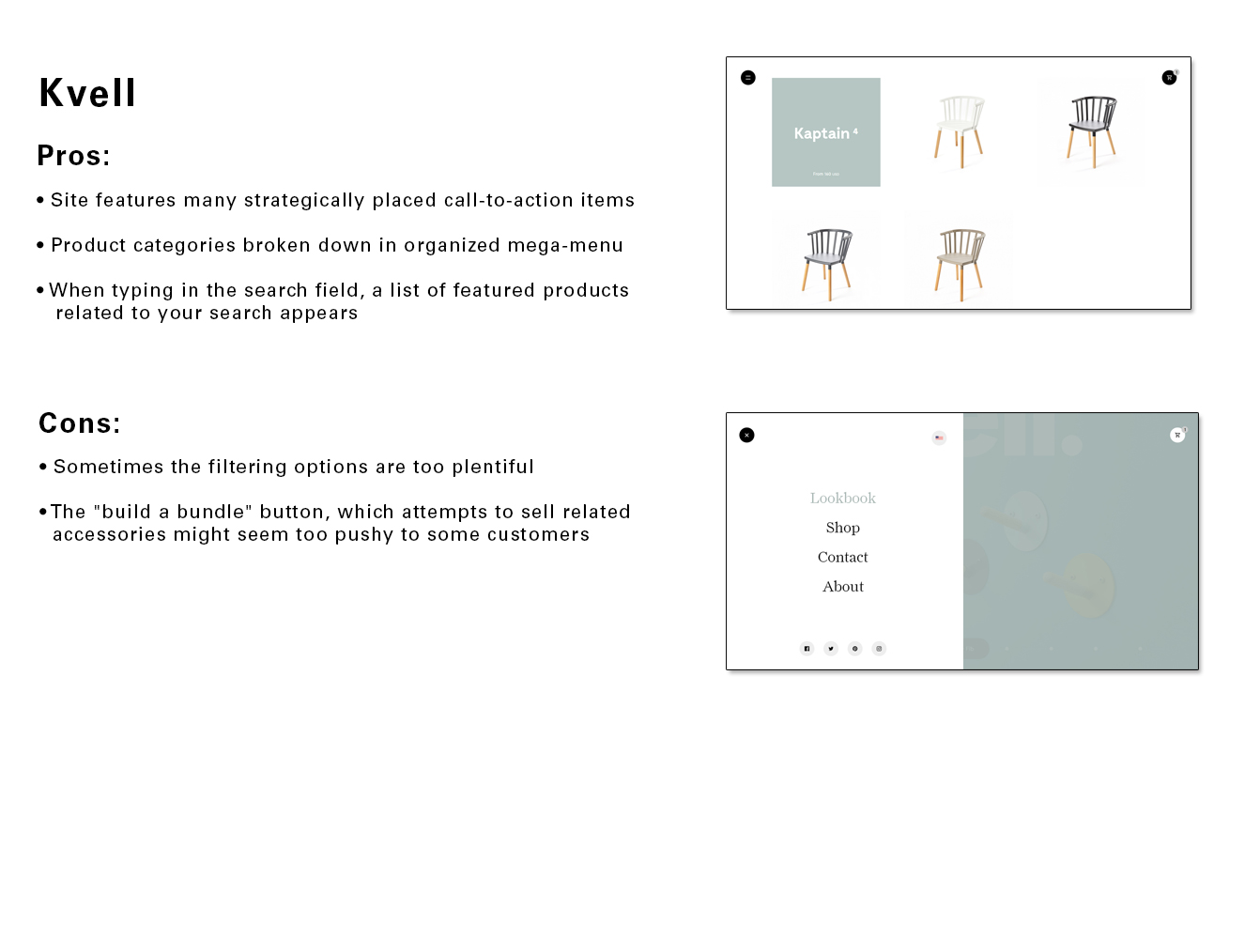
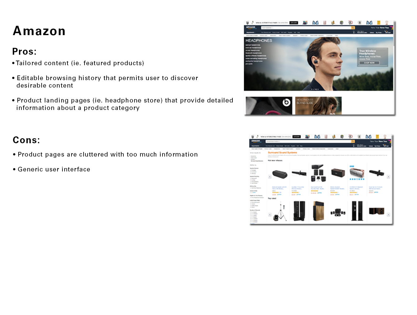
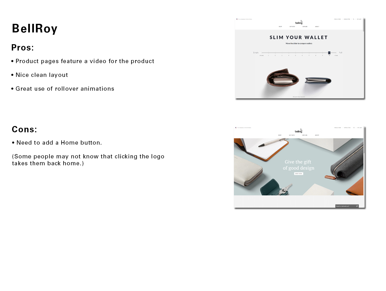
Analysis of two major e-commerce competitors and one niche site identified patterns in navigation, filtering, and product presentation that correlate with higher conversion rates and lower bounce rates. Insights informed the selection of features such as a mega menu and contextual filtering, prioritized based on potential impact on engagement metrics.
Summary:
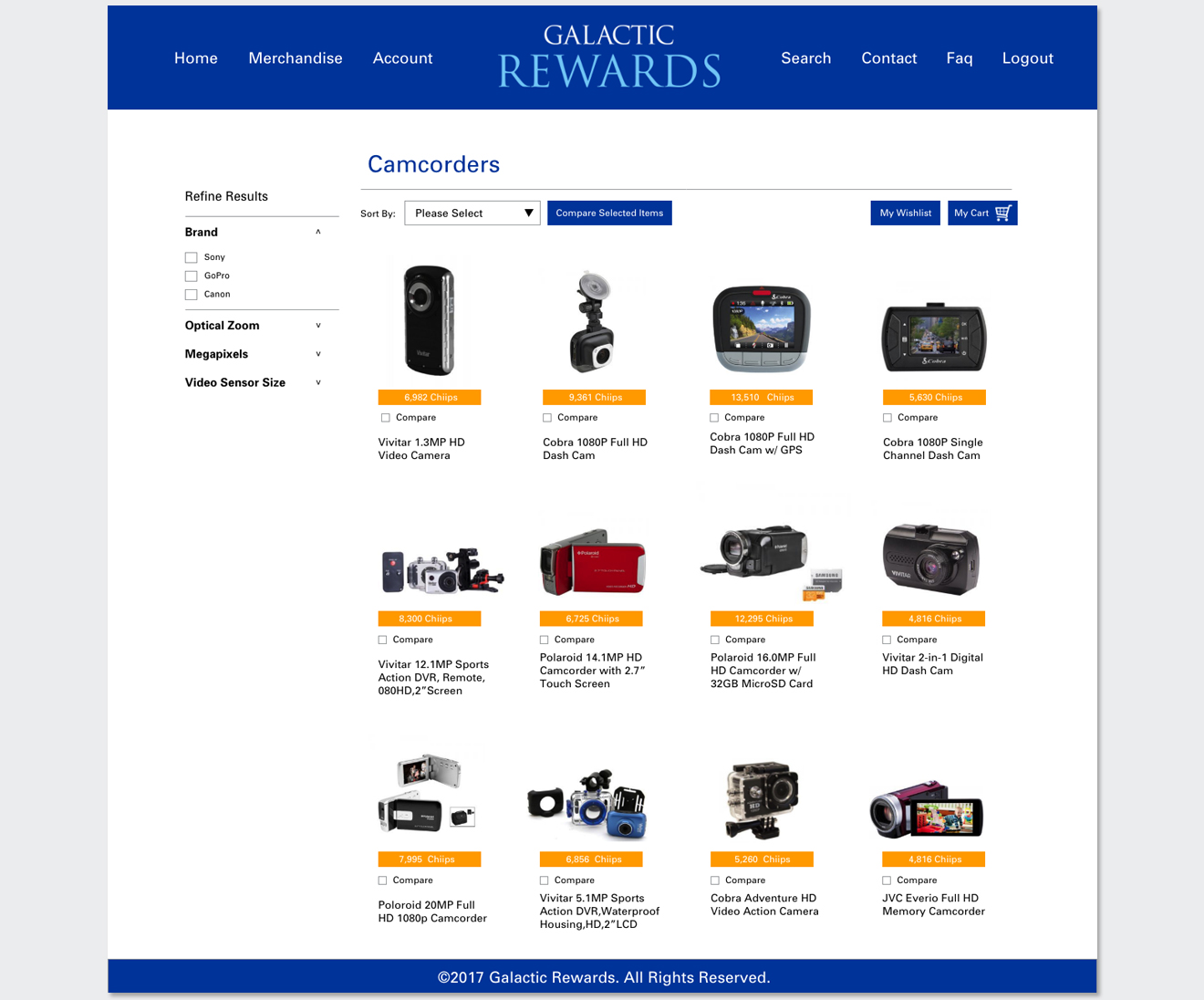
After evaluating the competition, the marketing team had a decent list of features that would significantly improve the online catalog. In addition to a mega menu, the team decided that well-placed filters would greatly improve the user experience.
User Task Flows

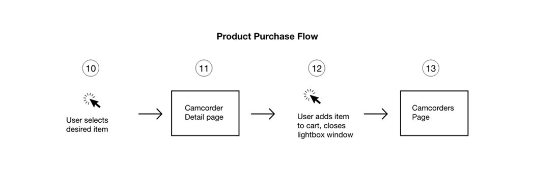
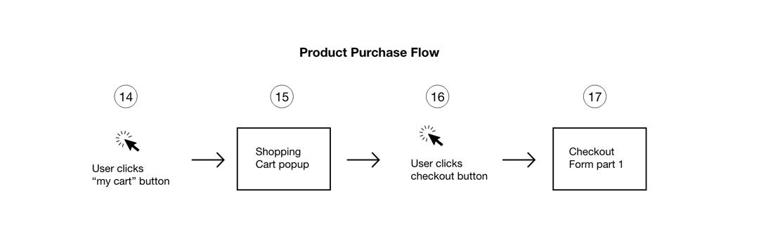
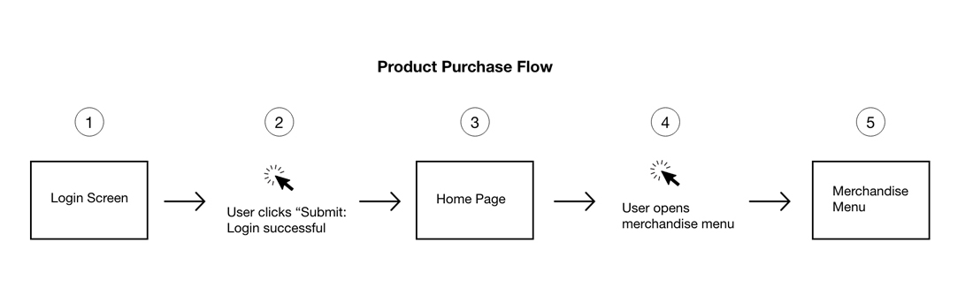
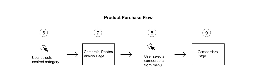
Task flows were documented to model key user actions, from browsing to purchase, enabling identification of friction points and opportunities for optimization.

Wireframes

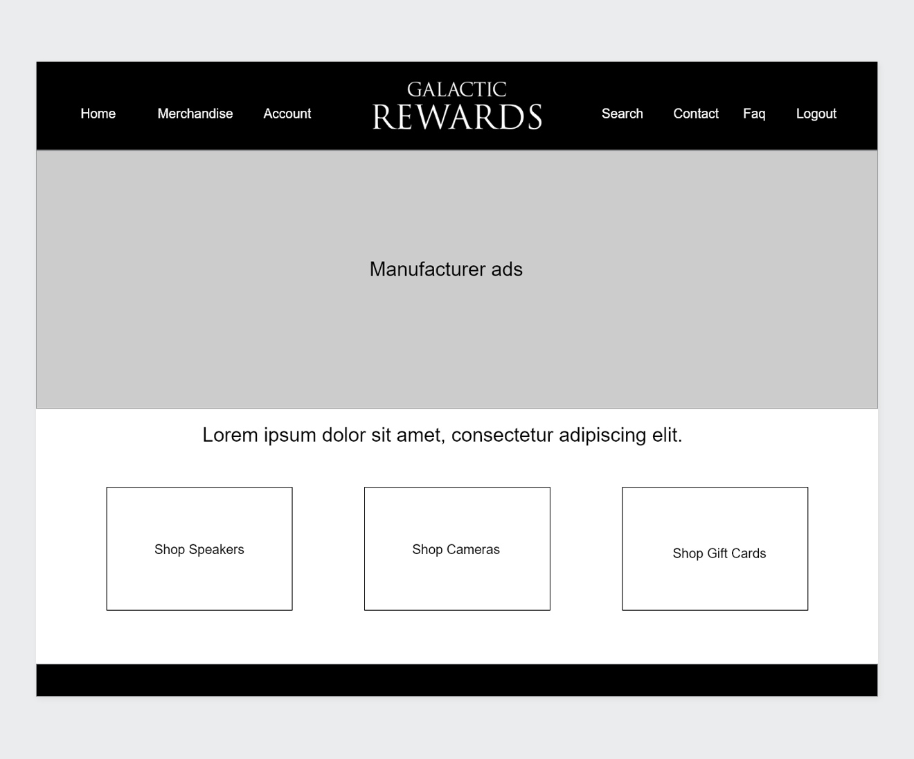
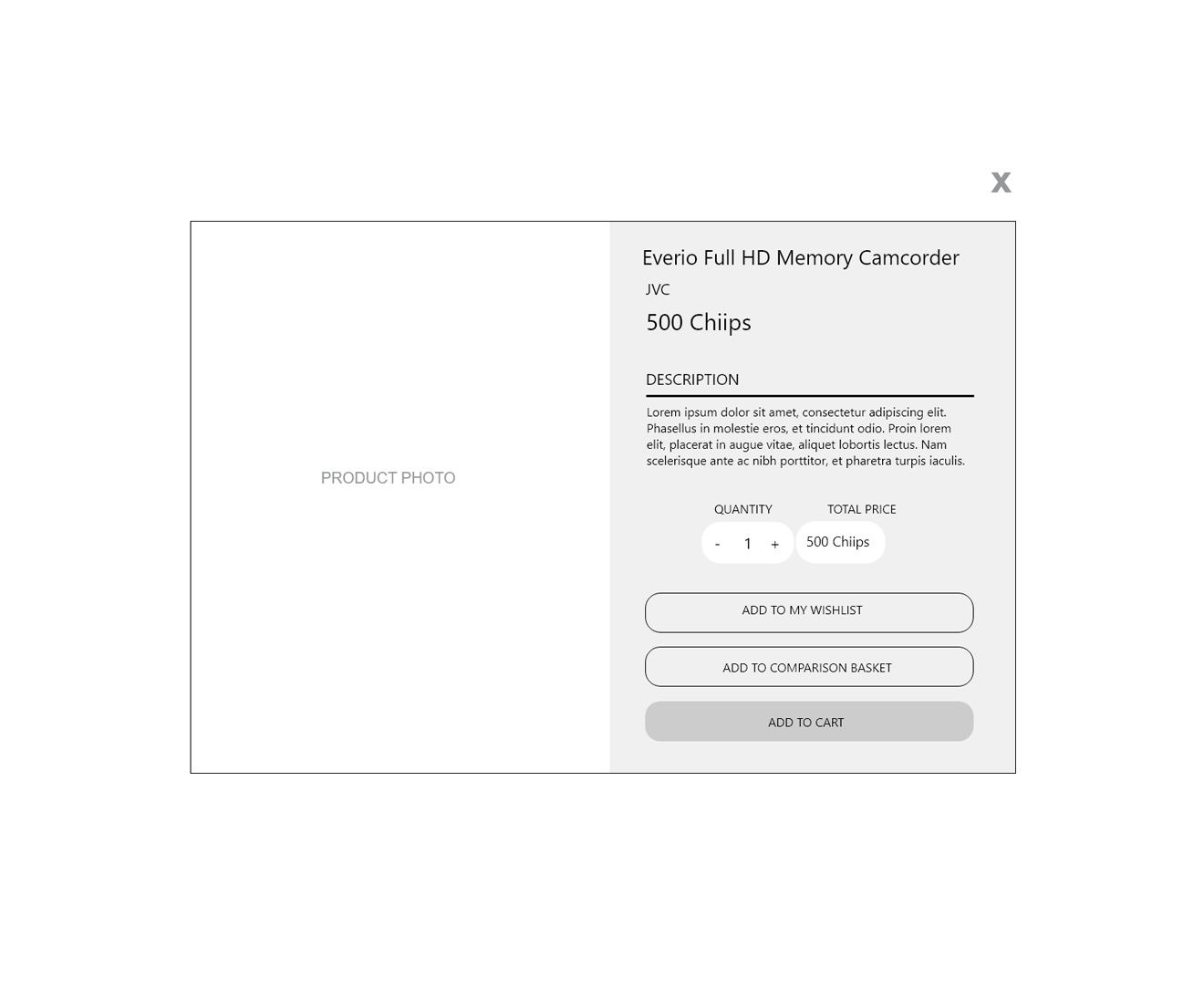
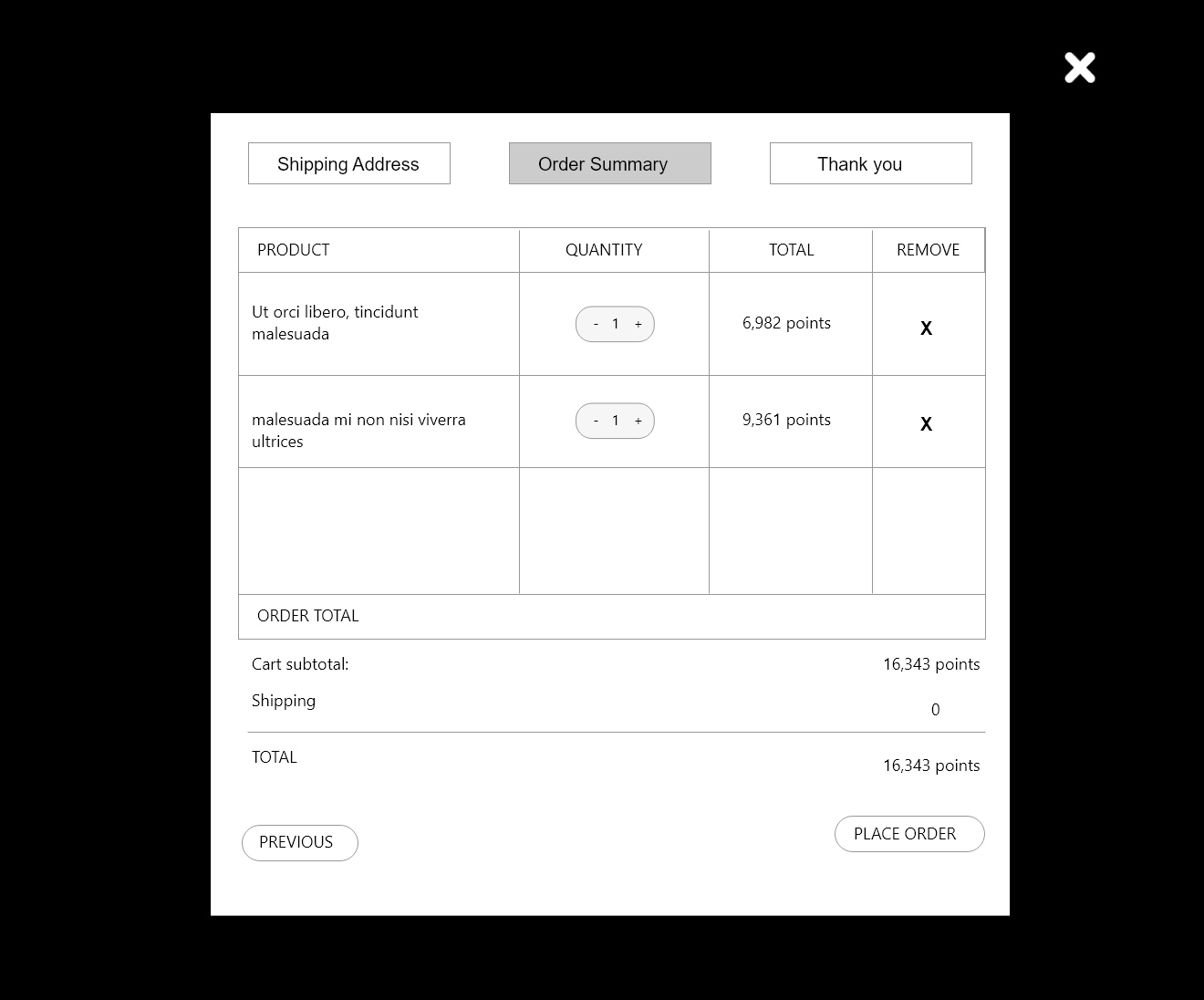
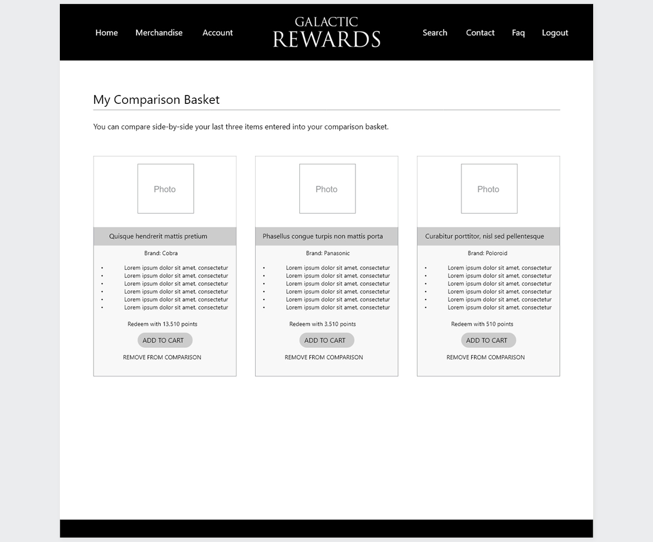
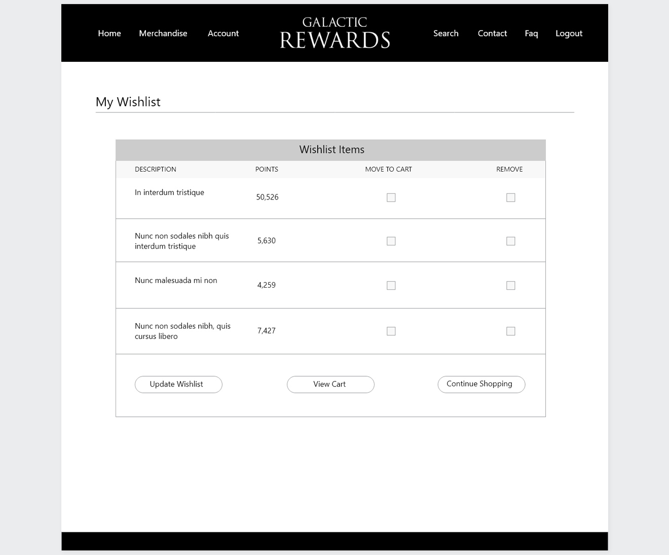
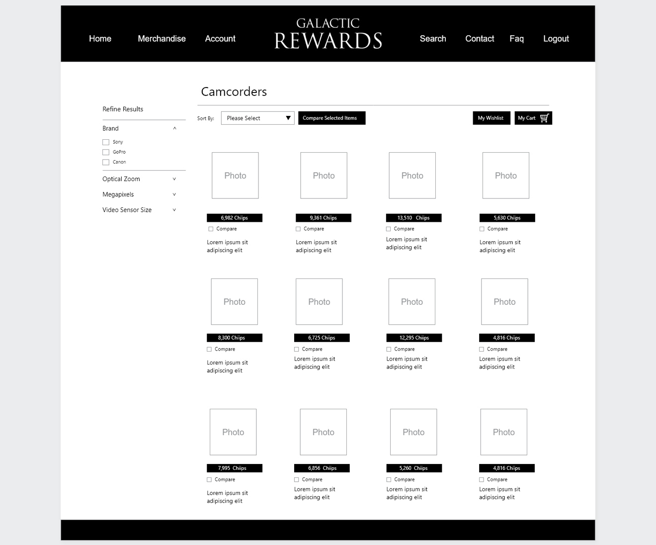
Wireframes structured the catalog to reduce cognitive load and streamline product discovery, providing a clear blueprint for measurable improvements in click-through and conversion metrics.

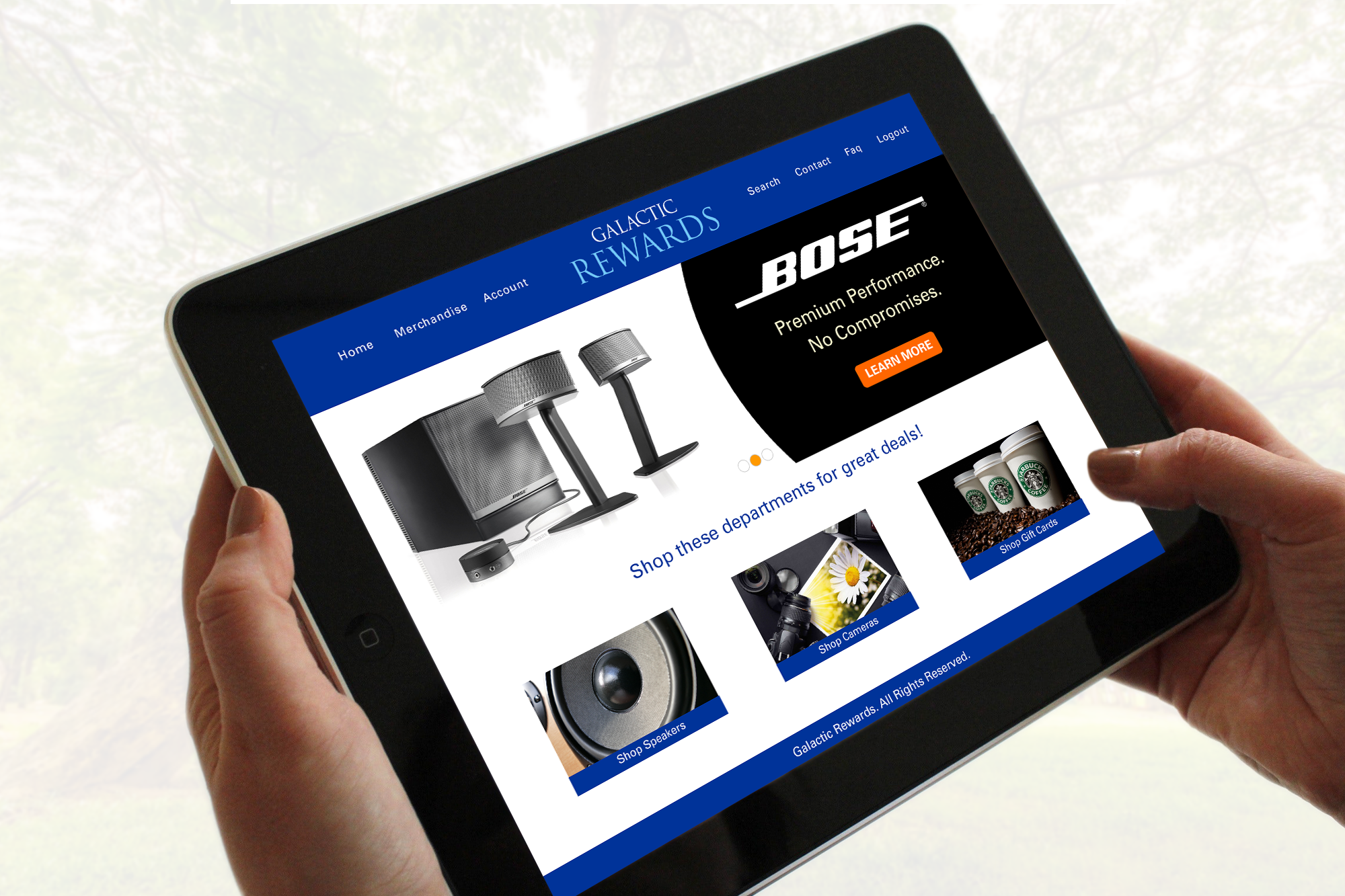
Hands holding a tablet displaying the Galactic Rewards homepage UI layout featuring Bose promotional banners and shop department cards.

User Interface Mockups


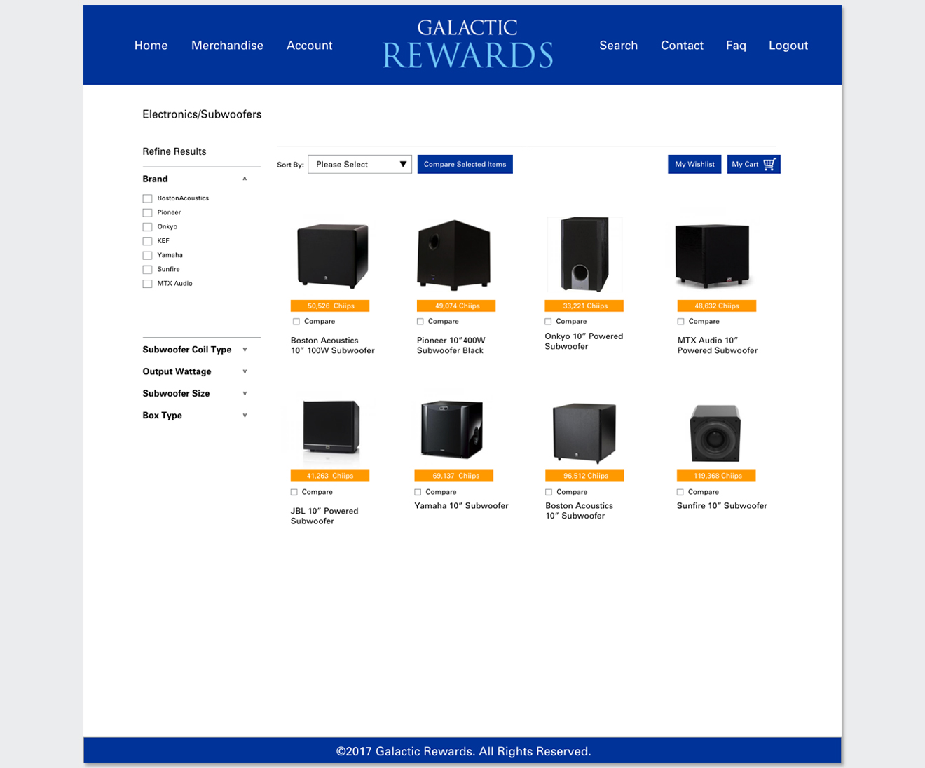
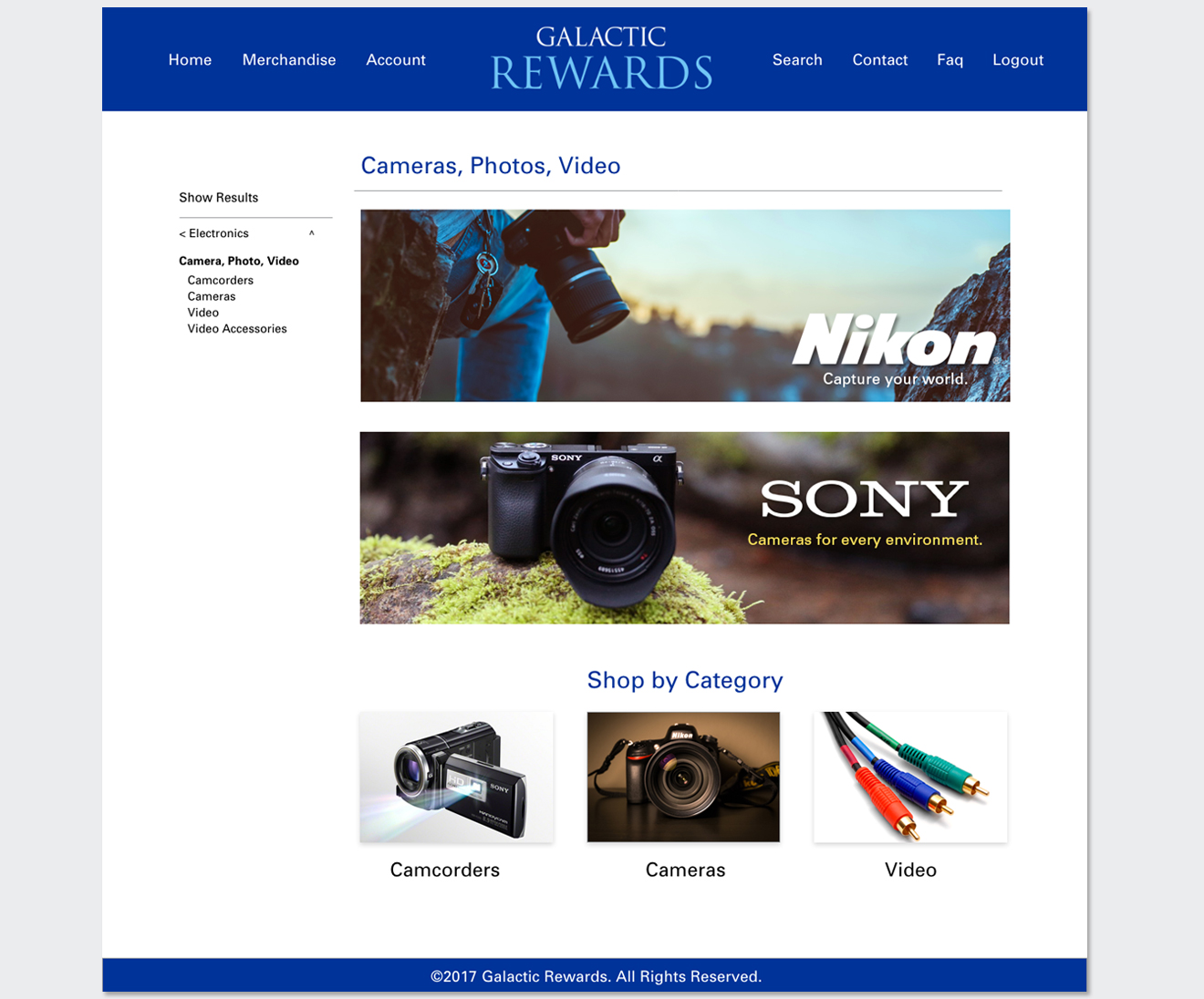
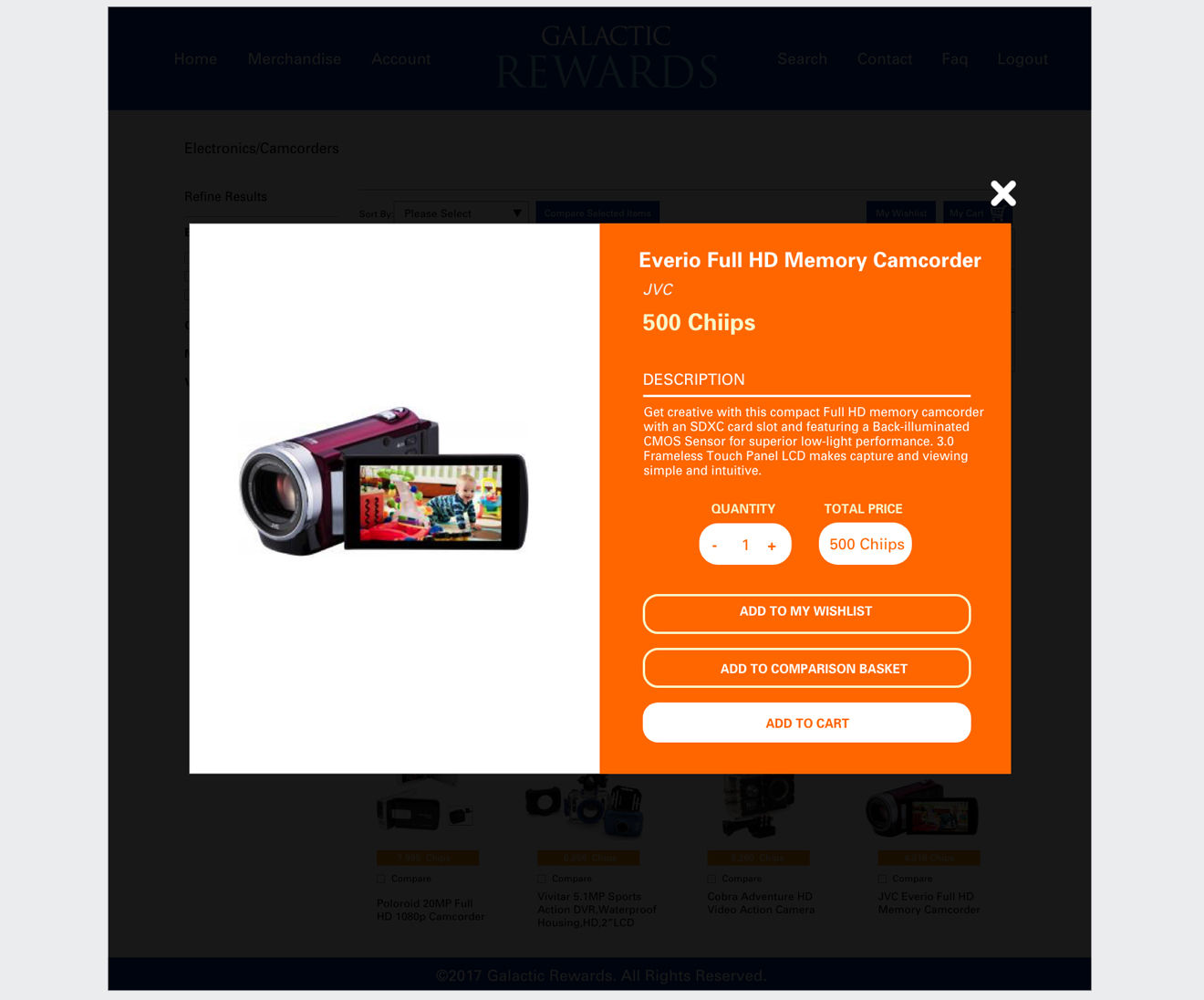
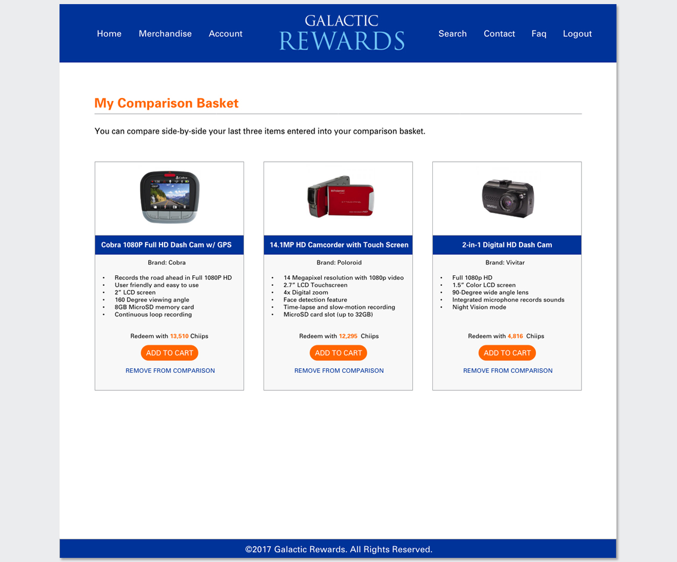
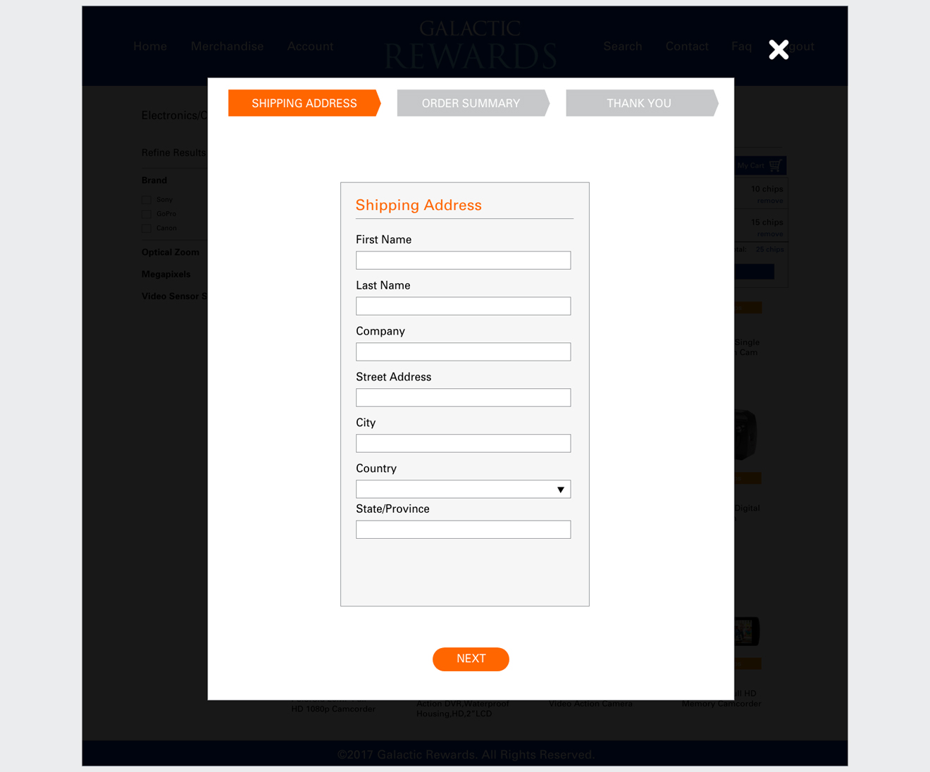
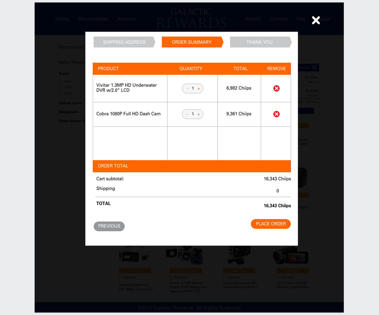
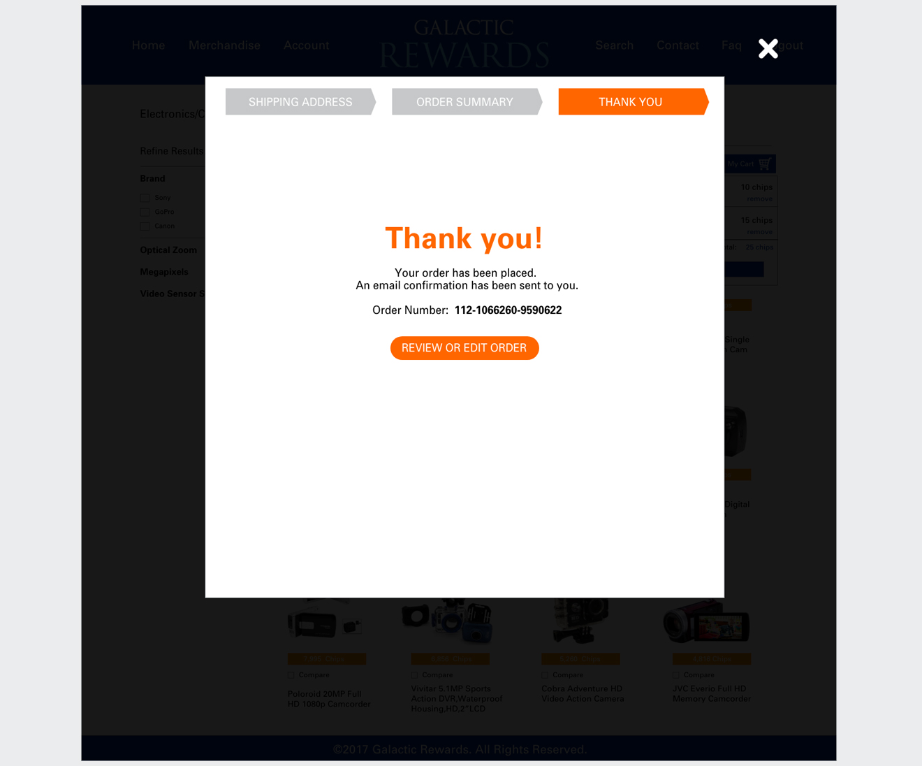
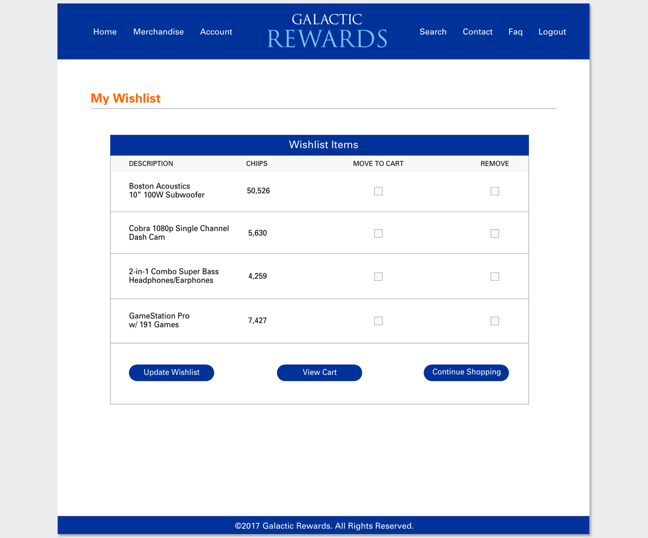
Once the wireframes were approved, my next step was to create high-fidelity mockups. Since the main focus of the project was the structure of the catalog, supporting pages such as FAQs and Contact Us were omitted from the layout.

Prototype


High-fidelity mockups and an interactive Azure prototype allowed stakeholders to validate the design against KPIs, including anticipated improvements in user engagement, time-on-site, and task completion rates.

VIEW PROTOTYPE

Conclusion


The redesigned catalog was validated by stakeholders and positioned for future implementation. Strategic improvements, such as optimized navigation and targeted filters, laid the foundation for measurable increases in engagement, usability, and ROI of the incentive program’s digital touchpoints.